
Migration is in the news every day, yet data and evidence in this field are in bad shape. The call for better data and evidence on migration is a common mantra in international reports and policy statements. While actors in this field are eager to lament the gaps in data, there seems to be less excitement about investing resources to close them. Why?
There are several reasons. First, investments in data are a hard sell. It is easier to persuade the general public that their taxes should go towards helping migrants directly through humanitarian, education or labor market interventions rather than through collecting better data. Second, the impacts of data improvements are reaped in the mid- and long-term while politicians need to market quick results. Good evidence, unfortunately, takes time. Third, improving data is hard and expensive. You need experts, trained staff, data collection infrastructures, IT, enumerators going door-to-door, and finally, you need to make sure findings then translate into policy. Even when data are available, they are not communicated in a way that reaches the right audiences.
What does all that have to do with the title of this blog post?
Great visualizations of migration data are among the most powerful tools in our arsenal for advocating the need for data. They show what data can do. They reduce complexity. They draw new people in and effectively raise attention to important issues. Good visualizations are difficult – walking the fine line between reducing complexity and misleading the reader and between making something look nicer and compromising content.
The list below features some examples of migration data visualizations. There is something “cool” about all of them. Of course, the list is not exhaustive.
Can’t find your viz below but it is clearly better? Think I have missed other obvious examples? Send me an email and we will incorporate them in the next post.
1. The power of perception
As part of their series “Perils of Perception”, the survey firm Ipsos Mori reports on what people think about how many immigrants live in their country and contrast it with the actual number. Simple but powerful.

2. Missing migrants
Based on data from IOM’s Missing Migrants Project, Valerio Pellegrini and Michele Mauri built an impressive map of the Mediterranean showing migrants’ profiles and where they have gone missing.
")
3. Theories of migration
Our colleagues from the European Commission’s Knowledge Centre on Migration and Demography have brought dry theories to life using infographics and drawings.

4. Environmental migration
In collaboration with IOM, the Zoï Environment Network created very detailed maps of where climate change may affect communities and induce migration.

5. Global bilateral migration flows
Guy Abel, Nicola Sander and Ramon Bauer developed interactive circular plots showing to/from where people migrate and how many people migrate between countries and regions.

6. Where Syrians find refugee
The Economist featured this viz in their September 2015 issue. It shows where Syrian refugees are scattered across the world.

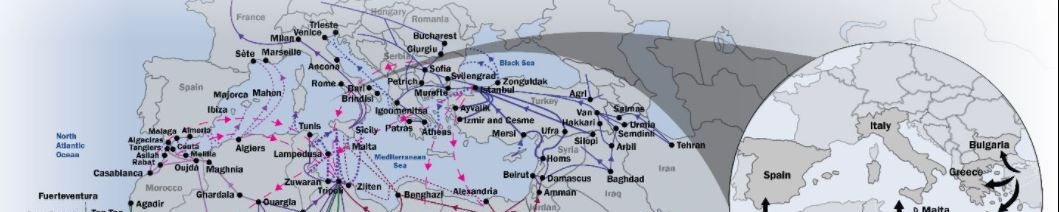
7. Mixed migration flows to Europe
If you have not already noticed, I like maps. Here is another good one. Colleagues from the IOM Displacement Tracking Matrix have mapped main routes of mixed migration to Europe from Africa and the Middle East. Their other maps also show the size and composition of migration flows.

8. Migrants and labour force growth
With a simple bar chart, the Mckinsey Global Institute shows how much of the percent of growth in workers in several immigration countries is due to migration.

9. Refugees—past to present
Our friends at UNHCR have created an interactive dashboard that illustrates historical data on refugee populations by country. By hovering over the bar chart or map, the user can explore changes in the number of refugees going back to the year 1960.

10. Irregular migrants
Of course, I cannot end this blog without some shameless self-promotion. My colleagues at IOM GMDAC have done a great job of using an easy infographic to clear up confusion around the definition of “irregular” migrant.