Mapping the population distribution at the city level based on Twitter collected data
Summary
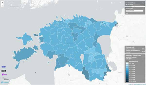
This project visualizes the population distribution in cities around the world using Twitter data. Distinguishing between residents and tourists, it develops innovative infographics that help better understand how intertwined the daily lives of residents and short-term visitors are. It is supported by MapBox, which provides maps that are automatically updated using artificial intelligence algorithms.
Results
This project effectively illustrates how Twitter data can be used as an innovative data source to represent the distribution of residents and tourists in cities around the world. It analyzed 3 billion Tweets and presented infographics for 29 cities, reflecting the geographic distribution of residents and tourists within them. Overall, this project is a useful approach to producing visual infographics of city populations around the world from Twitter data; it could also be replicated well with other social media data, such as Facebook, LinkedIn, and Instagram.
(Image: © Labs MapBox)


